Brand Style Guide
The Grayline visual system in one place: palette, type, and imagery direction, for anyone producing collateral for the brand.
Color
Palette
Grayline reads as raw concrete: a warm off-white ground, near-black ink, a mid concrete grey, and a single burnt-orange accent used sparingly. Every value below matches the live site theme exactly.
- Cream, page background: #F2F0ED
- Ink, primary text: #1A1A1A
- Charcoal, primary UI and buttons: #2B2B2B
- Concrete, secondary and dark sections: #6E6E6E
- Burnt Orange, accent and emphasis: #D4622A
Type
Typography
Display type is set in Syne, uppercase and tight, for headlines and section headings. Body copy is set in Spectral, a serif chosen for long-form readability and an editorial, architectural feel. Two families, three sizes, nothing more.
- Display: Syne, 700 to 800 weight, uppercase, tight tracking
- Body: Spectral, 400 to 500 weight, generous measure
- Three sizes only: display, heading, title
- Eyebrows: Syne, uppercase, wide tracking, burnt orange

Logo
The wordmark
The wordmark is set in Syne, uppercase, with a burnt-orange period after GRAYLINE. On light surfaces use ink on cream. On dark or photographic surfaces reverse to cream with the same orange period.
- Clear space equal to the height of the G on all sides
- Ink on cream for light surfaces
- Cream on concrete or photography for dark surfaces
- Never stretch, recolor, or add effects to the mark
Imagery direction

Material detail
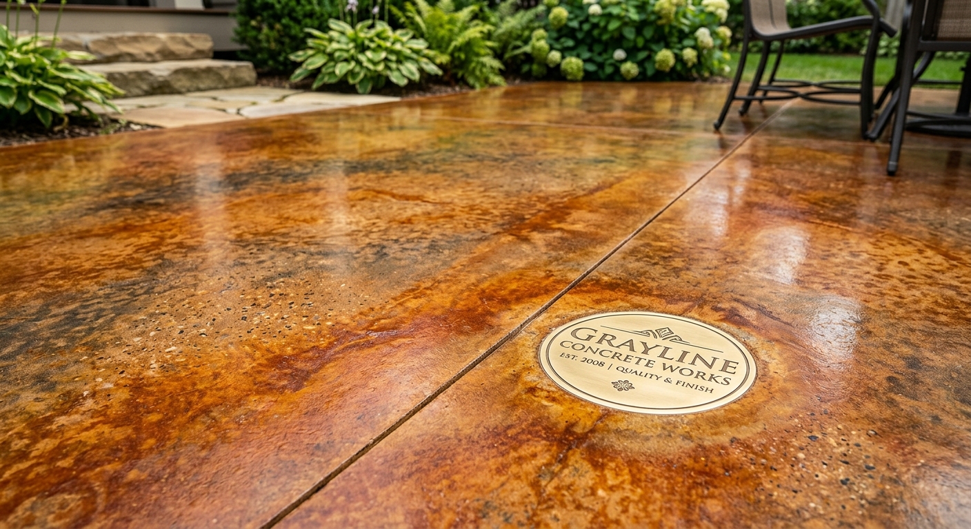
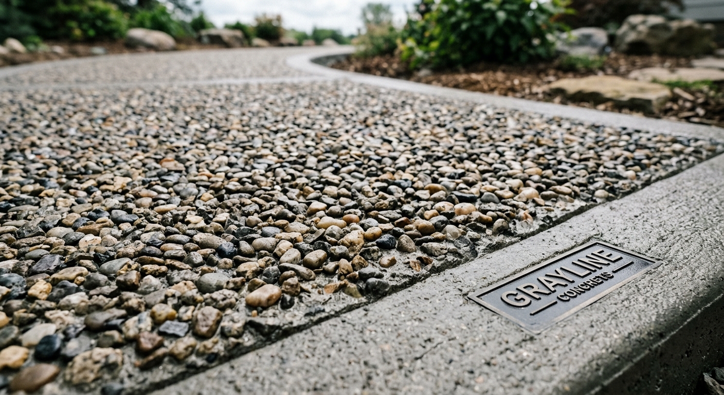
Tight, textural shots of the finish: edges, stamps, aggregate.
Work in progress
Real crews, real pours, documentary daylight tone.
Finished in context
The result living in its setting, magazine not flyer.
Reference
USE IT WELL
This guide keeps every Grayline surface consistent. Questions about brand usage? Reach the team.